
The Tufte Test: Teaching an AI Agent to Make Better Data Visualizations
AI agents can make data visualizations now. Ask Manus, Claude, or ChatGPT to chart a dataset and you'll get something back in seconds. The output is almost always... fine. Functional. Generic. The kind of chart that communicates data but doesn't communicate insight.
I moderated r/DataIsBeautiful for years and have spent over a decade obsessing over what separates a good chart from a forgettable one. It keeps coming back to the same principles Edward Tufte laid out decades ago: maximize data-ink, label things directly, annotate the insight, don't distort proportions. These are the basics. AI agents don't apply them consistently unless you hold them to it.
So I encoded Tufte's principles as a quality standard with concrete pass/fail criteria and pointed an AI agent at a real dataset. One instruction: keep improving until you pass.
The setup
I used Manus for this. I gave it a CSV of women's bachelor's degree percentages across STEM fields in the USA from 1970 to 2011, a dataset I originally visualized over a decade ago. One prompt: visualize this data.
Here's what Manus produced:
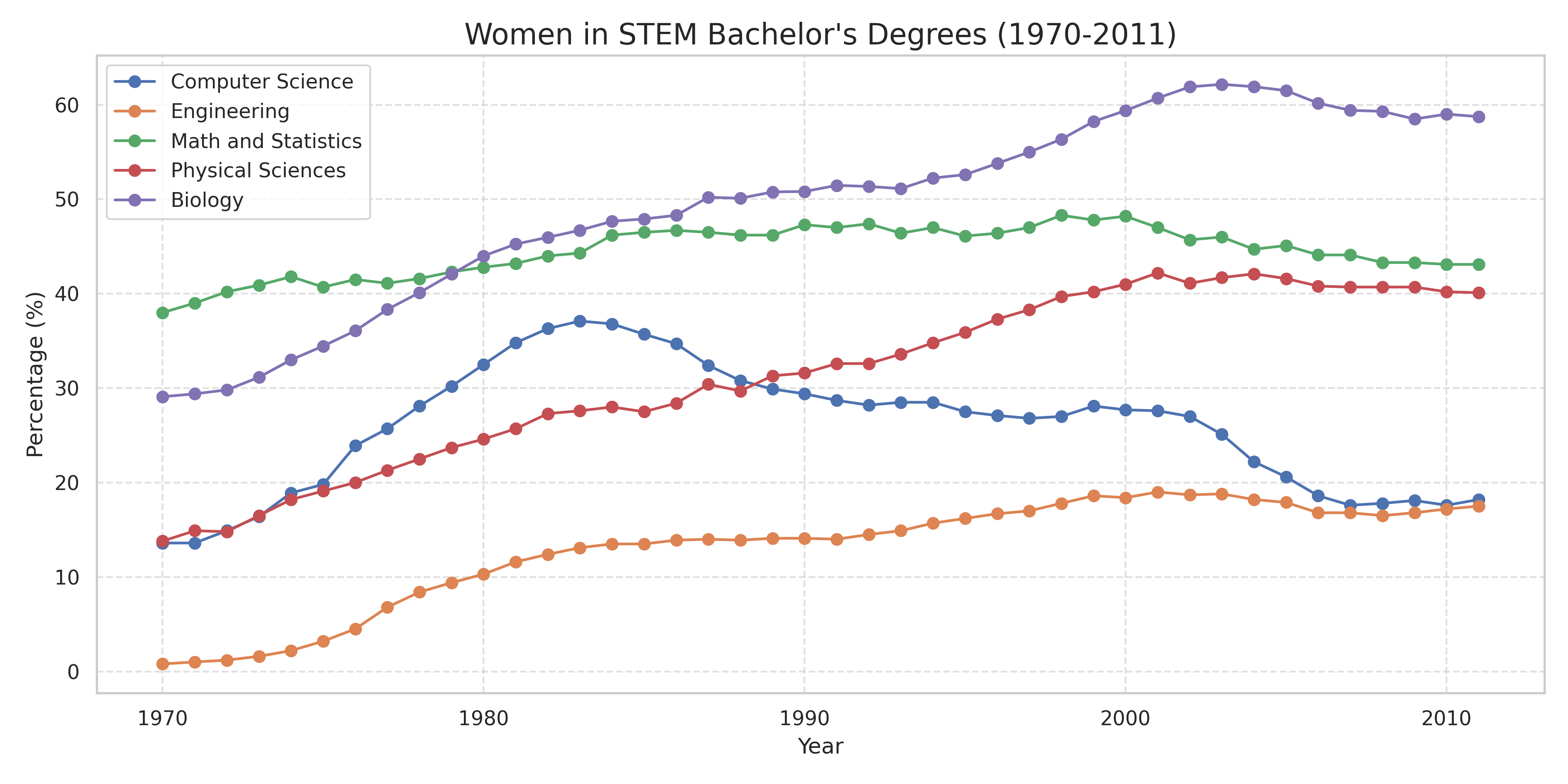
This is what you get from any AI agent today. Correct data, readable axes, nothing technically wrong. But it uses a legend box instead of direct labels. No annotations calling out, say, the dramatic rise and fall of women in Computer Science. Default color palette. Fine for a first draft, not something you'd publish.
The Tufte Test
The quality standard I built encodes seven of Tufte's core principles: data-ink ratio, no 3D effects, direct labeling, axis readability, muted purposeful color, integrated annotations, and graphical integrity. Each criterion has specific pass/fail conditions. Hand it an image of any chart and it returns specific feedback on what passes and what fails.
I handed Manus the Tufte Test and told it to keep improving the visualization until it passed.
The first submission came back with two failures: no direct labels, no annotations. Five criteria already passed. A quality standard gives an agent something a vague prompt never can: a precise list of exactly what to fix.
Manus got to work. The legend box became direct endpoint labels on each line. A subtitle pulled the key insight to the top. An annotation marked the Computer Science peak: "Peak: 37.1% in 1983." It kept what was already working and fixed what wasn't.
Here's the final version:
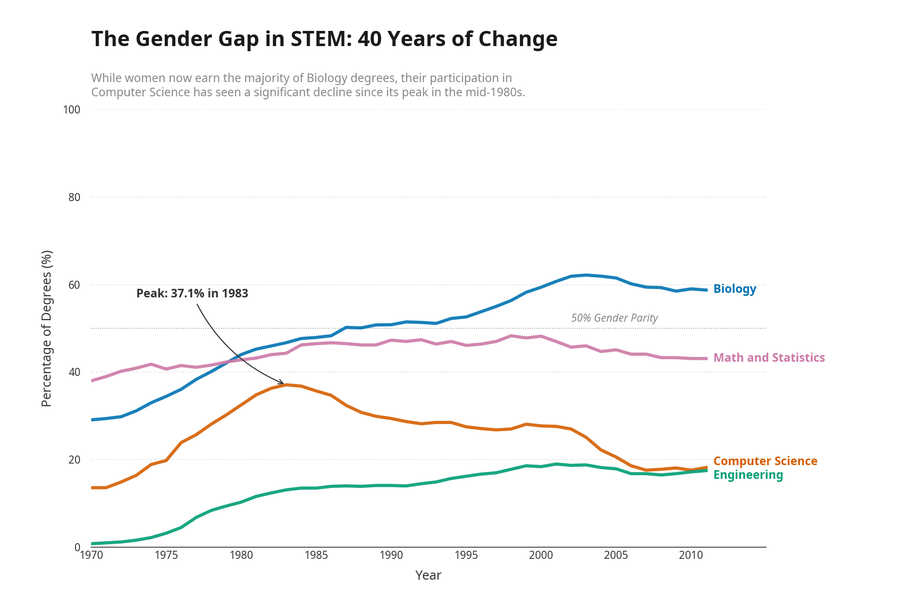
Two prompts from me. One to create the visualization, one to run the Tufte Test. Everything in between was autonomous.
Why this matters
Manus isn't special here. Any AI agent that can revise its own work could do this. What matters is the pattern: encode expert judgment once as a reusable, verifiable workflow, and every AI agent in your stack can build against it.
Today it's data visualization. Tomorrow it's clinical documentation or legal briefs. The same pattern applies anywhere an expert can articulate what "good" looks like. You encode that judgment once as a reusable, verifiable workflow, and your standards scale without you reviewing every output manually.
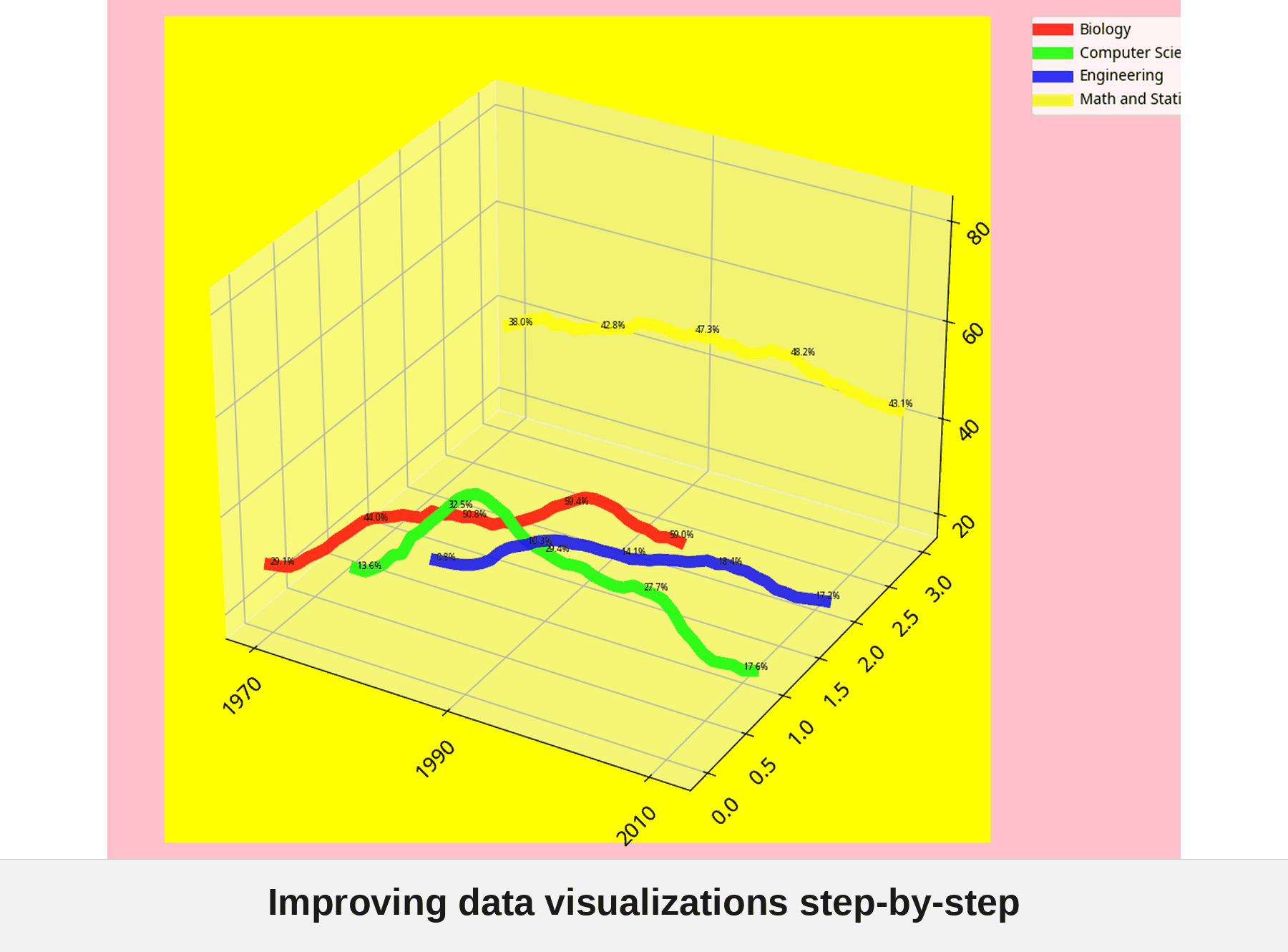
The fun version
I also asked Manus to generate the worst possible version of this chart first, then improve it one Tufte principle at a time. The progression from atrocity to polished final product is worth watching:
Try the Tufte Test yourself
I packaged this as the high-signal-chart-workflow template on Goodeye. The Tufte design checks and a rubric judge are built in, so any AI agent can run it and keep improving a chart until it passes. Browse it, then run it from the CLI or an MCP server.